
Freetype, included in the font stack on
Unix, is quite
complex. There are so many layers to get it to do what it does that
it’s easy to get lost. From finding the font, to actually rendering it,
and everything in between.
Like most of the world, I use a rather low screens definition
(1366x768 with 96 dpi) and rather old-ish laptop, unlike some font
designers that live in a filter bubble where everyone has the latest
macbook. Thus, good and legible font
rendering is important.
Let’s play with lesser known toggles available to us when it comes to font
rendering and see what they do, let’s have fun and explore possibilities.
A General Picture
Generally, to make a font look better on screens, which are arrays of pixels, we use a combination of these three:
- Antialiasing: Applying a light shade around the glyph. It is useful at small scale, when you don’t have enough pixels, but it makes most glyphs look bolder.

- Subpixel rendering: A technique similar to antialias but using subpixels, the color components inside the pixels. By applying a small amount of colors on the sides you can reach more granular precision. However, if applied clumsily, or if you simply move the window containing the text, these colored subpixels will become apparent, what we call fringe.
![]()
- Hinting: Pixels are blocks but text is made of curves, that means these curves will never match exactly with screen pixels. Hinting is about repositioning or selecting the closest pixels while trying as much as possible to keep the shape of the glyph intact. There are multiple levels of hinting, hinting information provided by the font itself (bytecode interpreter hinting), and hinting provided by the rendering library (auto-hinting).
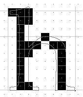
NB: “It’s just text”… This article is yet another that shows how fonts aren’t as easy as they look. For more info about the font stack, please visit my previous article on the topic, and if you want an idea of what it means to draw them on the screen take a look a this article.
What is applied, when, how to control all of this, can we see what they do, and should we even care?
Freetype and fontconfig default rendering these days is pretty good,
so there shouldn’t be anything to worry about; Until there’s something
to worry about, like a font not looking the way you want.
Our first stop will be something that intrigued me because I haven’t
heard many talk about it: the Freetype driver’s properties.
The Freetype driver is used whenever hinting is needed, so this is the
part it actually changes — how hinting is applied.
Getting The Right Tools For The Task
Let’s start with arming ourselves with ways to easily test all this.
Freetype2 demos utilities are a must, you can clone them
here
or fetch them from your package repositiory, for example
Debian and Arch
Linux.
These will give you a bunch of useful tools such as ftdiff, ftview,
ftstring ftgrid, fttimer, ftbench, and others. The most important
ones for us are ftdiff and ftgrid.
Example usage:
ftdiff -r 96 -s 10 ~/.local/share/fonts/times.ttf
ftgrid -r 96 -f 20 10 ~/.local/share/fonts/times.ttf
ftstring -r 96 -m 'Hello World!' 10 ~/.local/share/fonts/times.ttf
Additionally, you can install pango-view from pango-tools
to later test if fontconfig applies your configurations
properly. It can be used by preparing a file written in pango
markup
and displaying it using pango-view --markup file.pangpang.
You can set the fontconfig debug level higher to see which font is
actually loaded by setting the FC_DEBUG to something like 4096,
FC_DEBUG=4096.
More values can be found here, we’ll use them later to see if our fontconfig settings are applied properly:
Name         Value    Meaning
---------------------------------------------------------
MATCH            1    Brief information about font matching
MATCHV           2    Extensive font matching information
EDIT             4    Monitor match/test/edit execution
FONTSET          8    Track loading of font information at startup
CACHE           16    Watch cache files being written
CACHEV          32    Extensive cache file writing information
PARSE           64    (no longer in use)
SCAN           128    Watch font files being scanned to build caches
SCANV          256    Verbose font file scanning information
MEMORY         512    Monitor fontconfig memory usage
CONFIG        1024    Monitor which config files are loaded
LANGSET       2048    Dump char sets used to construct lang values
MATCH2        4096    Display font-matching transformation in patterns
Yet another way is to test directly in your browser URL bar:
data:text/html,<meta charset="utf8"><p style="font-family: Times New Roman;">Hello World</p>The Freetype2 Drivers Properties
So let’s get back to our testing of Freetype2 drivers.
On this documentation
page,
ft (freetype) properties are listed and are said to affect the behavior
of the drivers, each touching a different one. They are set by modifying
the FREETYPE_PROPERTIES environment variable, normally loaded from
/etc/profile.d/freetype2.sh.
However, most of the ones listed are targeted at the CFF, Type 1,
and CID fonts driver and not at TrueType fonts, so they do nothing
if you don’t have these font types. The only toggle available for
TrueType
is the interpreter-version which controls the bytecode interpreter,
the rasterizer, and thus how the outline gets hinted.
The options available to us are the following:
- 35 — For classic mode GDI (Win 98/2000)
- 38 — GDI+ old (Vista, Win 7), Infinality, considered slow
- 40 — For minimal mode (stripped down Infinality, this is the default) (After Win 7)
Kind of weird that we jump from 35 to 38, where did 36 and the rest go? The answer is that it’s a choice from the Freetype devs to only include those and not the ones in between.
And the differences look as follows, notice the native hinter in the left column:
- v35
FREETYPE_PROPERTIES="truetype:interpreter-version=35" ftdiff -r 96 -s 10 ~/.local/share/fonts/times.ttf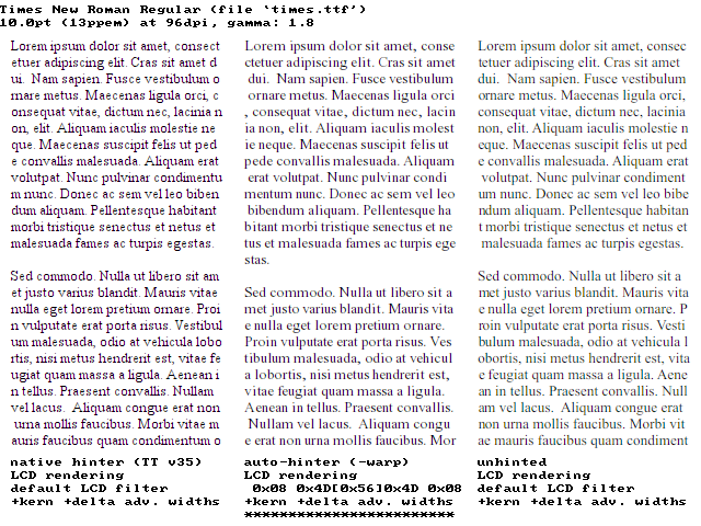
FREETYPE_PROPERTIES="truetype:interpreter-version=35" ftgrid -r 96 -f 36 10 ~/.local/share/fonts/times.ttf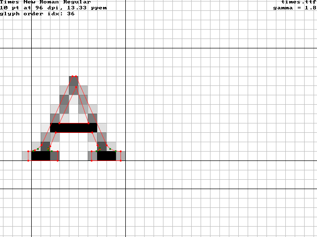
- v38
FREETYPE_PROPERTIES="truetype:interpreter-version=38" ftdiff -r 96 -s 10 ~/.local/share/fonts/times.ttf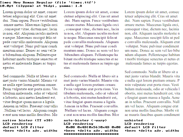
FREETYPE_PROPERTIES="truetype:interpreter-version=38" ftgrid -r 96 -f 36 10 ~/.local/share/fonts/times.ttf
- v40
FREETYPE_PROPERTIES="truetype:interpreter-version=40" ftdiff -r 96 -s 10 ~/.local/share/fonts/times.ttf
FREETYPE_PROPERTIES="truetype:interpreter-version=40" ftgrid -r 96 -f 36 10 ~/.local/share/fonts/times.ttf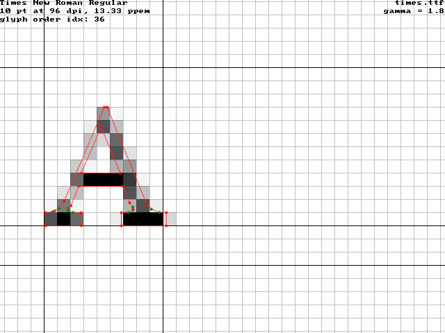
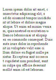
We can also test using pango-view (remember again that this should be a font
that has native hinting enabled but not the auto-hinter):
<span font_family="Times New Roman" font="10" foreground="black" alpha="83%">
Lorem ipsum dolor sit amet, c
onsectetur adipiscing elit, s
ed do eiusmod tempor incididu
nt ut labore et dolore magna
aliqua. Ut enim ad minim venia
m, quis nostrud exercitation u
llamco laboris nisi ut aliquip
ex ea commodo consequat. Duis
aute irure dolor in reprehende
rit in voluptate velit esse ci
llum dolore eu fugiat nulla pa
riatur. Excepteur sint occaeca
t cupidatat non proident, sunt
in culpa qui officia deserunt
mollit anim id est laborum.
</span>
You can also change the font via the --font= argument of pango-view.
FREETYPE_PROPERTIES="truetype:interpreter-version=35" pango-view --markup text.bangarang- v35
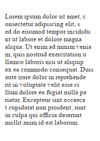
- v38
- v40

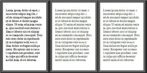
So definitely, older interpreter versions were rougher with hinting, much bolder, and could deform the glyphs. The newer ones are more minimal with it. We also notice that the auto-hinter isn’t that bad and that avoiding hinting can help. I took the specific case of the Windows font ‘Times New Roman’ because it has the reputation of rendering badly with Freetype, mostly because of the job the interpreter does. Applying very light or no hinting at all helps tremendously, even at very small point size as you can see in the next comparison. The hinting does indeed help legibility at this scale but the font shape and personality is completely destroyed.
From left to right: v35, v38, v40.
How Fontconfig Works
We’re not done with hinting yet, there can be many levels of hinting that can be applied, but let’s first take a detour and learn a bit about fontconfig and how to use it.
Fontconfig is the layer in the font stack responsible for loading the
font along with the configurations that tell the next layer how to find
the font file and what changes to apply when rendering it. It is usually
composed of a library, a preset of configuration files, and a bunch
of helpful tools all starting with the prefix fc- such as: fc-cache,
fc-query, fc-match, and fc-conflist, to name a few.
The configuration files are usually found in /etc/fonts/ and split into
the presets available /etc/fonts/conf.avail, and the chosen presets in
/etc/fonts/conf.d, which are symbolic links to the former.
The precedence of the rules is alphanumerical, a first-come
first-served principle, thus 01-custom-rule.conf will be loaded
before 99-not-important-rule.conf. Local user configurations, in
the user’s $XDG_CONFIG_HOME/fontconfig directory, are loaded from
one of these configurations that contains an include statement. On
my machine it is the 50-user.conf, so it’s precedence is lower
than anything loaded before it. This isn’t practical when testing
rules so rename this file to something like 01-user.conf. Now
anything you put in $XDG_CONFIG_HOME/fontconfig/conf.d or
$XDG_CONFIG_HOME/fontconfig/fonts.conf should have priority.
You can make sure the order and configurations are loaded properly by
using the fc-conflist command. It lists in order of precedence the
configurations found, the ones starting with a + are loaded, the ones
with - are not.
These files are composed of mainly 4 components:
- Match rules: If something matches, then edit the properties mentioned. There are ton of matching and editing rules, even including stuff like the program name that is currently trying to load the fonts and custom ones. You can also match at different times: when looking for a pattern/font, after finding the font, when scanning the font.
- Aliases creation: An alias is a font name shorthand, it’s useful when querying generic family names such as “monospace”.
- Inclusion of other configurations: There can be so many configuration files that it’s good practice to split them.
- Where to look for settings and fonts, and if some fonts should be
skipped entirely (like if they aren’t scalable — bitmap): You may
think that the location of fonts is a constant value, but it’s not. For
example, on my machine it’s set in
/etc/fonts/fonts.confas:
<!-- Font directory list -->
<dir>/usr/share/fonts</dir>
<dir>/usr/local/share/fonts</dir>
<dir prefix="xdg">fonts</dir>
<!-- the following element will be removed in the future -->
<dir>~/.fonts</dir>
Editing XML files is cumbersome, unfortunately today there aren’t many
GUIs or simpler tools to set these. I’ve found a single one to date
that is named fontweak but that
isn’t complete (I’ve also found font-manager which does a couple of things too, and there are a lot of font viewers like gnome-font-viewer, fontbase or fontmatrix but also lacking a matching rule editing feature).
It’s a shame because it’s rare to find people that have a clue about
how to actually set font configuration nicely.
If you want more info, you can consult man 5 fonts-conf. It’s heavy
content and can be confusing content, but still great content.
NB: Fontconfig is not enough to configure every graphical program,
some programs load font settings in a simpler way through Xresources, the
RESOURCE_MANAGER of X.
Testing Different Hinting
Let’s close this parenthesis and get back to hinting.
Fontconfig has 4 settings related to it, of which one is a matching
criterion and the other three are edit rules. They are the following.
fonthashint: Matching test to check if the font has built-in hints, namely bytecode interpreter hinting.hinting: If set to true, it tells the next phase, the rasterizer, that hinting in general will be applied.autohint: Use the autohinter instead of the normal hinter. This will skip entirely the bytecode interpreter.hintstyle: The harshness of the hinting that will be applied. It could either behintnone,hintslight,hintmedium, orhintfull. It needs to be mentioned that these will use a mix of the autohinter and bytecode interpreter if the font has hints. For example,hintslightwill snap on the vertical grid only buthintmediumandhintfullwill snap harder on the horizontal grid too.
Practically, what does it mean? Let’s show what a font looks like with a
combination of these hinting configurations.
Remember that if you’re having issues applying these configurations in
your user fontconfig file that you can set the FC_DEBUG environment
variable we mentioned before. Always be sure everything loads properly
by checking fc-conflist and the currently applied match rules via
fc-match --verbose YourFontSearchHere
Let’s test hinting enabled, autohint enabled, and full on grid snapping.
<edit mode="assign" name="hinting">
	<bool>true</bool>
</edit>
<edit name="autohint" mode="assign">
	<bool>true</bool>
</edit>
<edit mode="assign" name="hintstyle">
	<const>hintfull</const>
</edit>
What about disabling autohint and full on grid snapping.
<edit mode="assign" name="hinting">
	<bool>true</bool>
</edit>
<edit name="autohint" mode="assign">
	<bool>false</bool>
</edit>
<edit mode="assign" name="hintstyle">
	<const>hintfull</const>
</edit>
Not so pretty, maybe just snapping vertically is better, let’s try no-autohinter and a slight hinting.
<edit mode="assign" name="hinting">
	<bool>true</bool>
</edit>
<edit name="autohint" mode="assign">
	<bool>false</bool>
</edit>
<edit mode="assign" name="hintstyle">
	<const>hintslight</const>
</edit>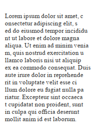
Better but it still looks too bold. Let’s try again the autohinter but with a softer hinting now.
<edit mode="assign" name="hinting">
	<bool>true</bool>
</edit>
<edit name="autohint" mode="assign">
	<bool>true</bool>
</edit>
<edit mode="assign" name="hintstyle">
	<const>hintslight</const>
</edit>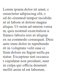
It looks very similar to the full hinting, let’s test without hinting at all.
<edit mode="assign" name="hinting">
	<bool>false</bool>
</edit>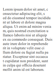
It seems like the auto-hinter is doing a good job at aligning the letters vertically in a subtle way. When zoomed in, you can clearly see how the letters seem a bit more compressed with the auto-hinter turned on.
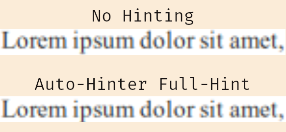
Overall, for the specific font I tested, “Times New Roman”, no hinting at all or slight auto-hinting are the best on my display.
Subpixel Rendering
Let’s move to subpixel rendering.
Fontconfig offers some preset to how harshly the subpixel rendering
is done. lcddefault is color-balanced and normalized, lcdlegacy is
neither normalized nor color-balanced, it uses any sub-pixels it can
find, lcdlight is similar to lcddefault but applies a lighter hint
to the surrounding pixels, and lcdnone disables it.
Additionally, there’s also ways to enable Microsoft’s Cleartype subpixel
rendering by recompiling Freetype (disabled by default because of patent),
and ways to tweak the subpixel rendering matrix by manually editing the
Freetype code. But why go through the hassle.
Before testing these, you should find out what’s the
subpixel geometry of your screen by consulting this
page, and set it as the
rgba property. Normally, preset files such as 10-sub-pixel-rgb.conf
already come installed so you simply have to symlink them to the
/etc/fonts/conf.d directory.
NB: These tests don’t seem to show differences with pango-view
but starting any other graphical program should be enough.
NB: Fringes are more apparent with white text on black background.
Here’s the result of the comparison, you can clearly see the fringes when the wrong subpixel geometry is chosen, here my screen has rgb geometry. Also, no-subpixel rendering at all seems like a very good choice for bitmap fonts, keep this in mind.
![]()
I’ve tried to notice the differences between lcddefault, lcdlight,
and lcdlegacy but it’s so minimal that it isn’t worth mentioning. So
lcddefault should be fine in most cases. Someone made a comparison
on this website if you want
to check.
NB: It is rare, but if fonts look deformed on your screen it might
be because your DPI isn’t detected properly by fontconfig. Find it
on X11 by doing xdpyinfo | grep -B 2 resolution and set it with the
following match:
<match target="pattern">
	<edit name="dpi" mode="assign">
		<double>96.0</double>
	</edit>
</match>
Antialiasing
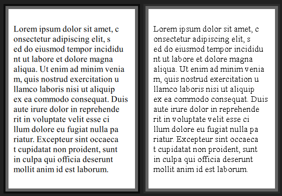
Antialias is the settings you should almost never turn off, unless your
font is bitmap/non-scalable.
This picture clearly shows the advantage of antialias on scalable
fonts. On the right is the non-antialiased version.
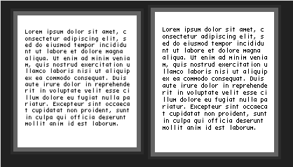
Weird things happen when the 10-scale-bitmap-fonts.conf preset is
present. The following image shows a bitmap font without hinting and
antialias on the left and on the right with them. Removing this file
should fix the font and show it as crisp as possible.
NB: If you want to convert bitmap/pcf/bdf fonts to be supported by Pango see this thread on the nixers.net forums.
Applying What We’ve Learned
Some fonts are known to render badly with Freetype, such as Windows fonts. So let’s test what we’ve learned to make them look better.
You can get a copy of the Windows font from a Windows machine, they
are present in the C:\Windows\Fonts\* directory (PS: I do not take
responsibility if you do this, for legal reasons).
You should now have the fonts, put them in either $XDG_DATA_HOME/fonts
(usually $HOME/.local/share/fonts) or $XDG_DATA_DIRS/fonts (usually
/usr/share/fonts).
Be sure to have followed the previous advice of renaming 50-user.conf
to 01-user.conf, and confirm that your local font configuration is
the first by executing fc-conflist.
Now let’s take the name of all the Windows font we got:
fc-query --format='%{family}\n' * | sort | uniq- Arial
- Arial Black
- Calibri
- Calibri Light
- Cambria
- Cambria Math
- Comic Sans MS
- Consolas
- Georgia
- Impact
- Javanese Text
- Segoe Print
- Segoe Script
- Segoe UI
- Segoe UI Emoji
- Segoe UI Historic
- Segoe UI Black
- Segoe UI Light
- Segoe UI Semibold
- Segoe UI Semilight
- Segoe UI Symbol
- Tahoma
- Times New Roman
- Trebuchet MS
- Verdana
- Webdings
- Wingdings
And let’s add some rules to our fontconfig file as follows:
<?xml version="1.0"?>
<!DOCTYPE fontconfig SYSTEM "fonts.dtd">
<fontconfig>

	<description>Make Windows Font Look Good</description>

	<match target="font">
		<edit name="iswindowsfont" mode="assign">
			<or>
				<eq>
					<name>family</name>
					<string>Arial</string>
				</eq>
				<eq>
					<name>family</name>
					<string>Arial Black</string>
				</eq>
				<eq>
					<name>family</name>
					<string>Calibri</string>
				</eq>
				<eq>
					<name>family</name>
					<string>Calibri Light</string>
				</eq>
				<eq>
					<name>family</name>
					<string>Cambria</string>
				</eq>
				<eq>
					<name>family</name>
					<string>Cambria Math</string>
				</eq>
				<eq>
					<name>family</name>
					<string>Comic Sans MS</string>
				</eq>
				<eq>
					<name>family</name>
					<string>Consolas</string>
				</eq>
				<eq>
					<name>family</name>
					<string>Georgia</string>
				</eq>
				<eq>
					<name>family</name>
					<string>Impact</string>
				</eq>
				<eq>
					<name>family</name>
					<string>Javanese Text</string>
				</eq>
				<eq>
					<name>family</name>
					<string>Segoe Print</string>
				</eq>
				<eq>
					<name>family</name>
					<string>Segoe Script</string></eq>
				<eq>
					<name>family</name>
					<string>Segoe UI</string>
				</eq>
				<eq>
					<name>family</name>
					<string>Segoe UI Emoji</string>
				</eq>
				<eq>
					<name>family</name>
					<string>Segoe UI Historic</string>
				</eq>
				<eq>
					<name>family</name>
					<string>Segoe UI Black</string>
				</eq>
				<eq>
					<name>family</name>
					<string>Segoe UI Light</string>
				</eq>
				<eq>
					<name>family</name>
					<string>Segoe UI Semibold</string>
				</eq>
				<eq>
					<name>family</name>
					<string>Segoe UI Semilight</string>
				</eq>
				<eq>
					<name>family</name>
					<string>Segoe UI Symbol</string>
				</eq>
				<eq>
					<name>family</name>
					<string>Tahoma</string>
				</eq>
				<eq>
					<name>family</name>
					<string>Times New Roman</string>
				</eq>
				<eq>
					<name>family</name>
					<string>Trebuchet MS</string>
				</eq>
				<eq>
					<name>family</name>
					<string>Verdana</string>
				</eq>
				<eq>
					<name>family</name>
					<string>Webdings</string>
				</eq>
				<eq>
					<name>family</name>
					<string>Wingdings</string>
				</eq>
			</or>
		</edit>
	</match>

	<match target="font">
		<test name="iswindowsfont" compare="eq">
			<bool>true</bool>
		</test>
		<edit mode="assign" name="hinting">
			<bool>false</bool>
		</edit>
		<edit name="autohint" mode="assign">
			<bool>false</bool>
		</edit>
		<edit mode="assign" name="hintstyle">
			<const>hintnone</const>
		</edit>
		<edit mode="assign" name="antialias">
			<bool>true</bool>
		</edit>
		<edit name="embeddedbitmap" mode="assign">
			<bool>false</bool>
		</edit>
	</match>

</fontconfig>This may look like a big script and it might be your first time seeing
someone write such script for fontconfig but don’t worry. It’s pretty
simple overall, it checks the name of the family of the font and sets
a variable to true iswindowsfont if it matches. Then, if this is set,
it configures the values we want for this group of fonts. You can play
with the values if you aren’t satisfied, the grouping should help.
You shouldn’t even have to run fc-cache, this should take effect as
soon as you restart an application that uses fontconfig.
fc-match --verbose 'Cambria' | grep iswindowsfont
# iswindowsfont: True(w)
Conclusion
This is it for this post.
I hope you’ve learned a thing or two about font configurations with
Freetype and Fontconfig and were surprised by at least one of them.
If you’ve enjoyed my article, have comments, suggestions, or simply want to say thanks, please leave a comment.
References
- https://www.freetype.org/freetype2/docs/text-rendering-general.html
- https://www.freetype.org/freetype2/docs/reference/ft2-properties.html
- https://dt.iki.fi/fontconfig-2
- https://eev.ee/blog/2015/05/20/i-stared-into-the-fontconfig-and-the-fontconfig-stared-back-at-me/
- https://git.sv.nongnu.org/freetype/freetype2-demos.git
- https://packages.debian.org/jessie/freetype2-demos
- https://www.archlinux.org/packages/extra/x86_64/freetype2-demos/
- https://developer.gnome.org/pygtk/stable/pango-markup-language.html
- https://linux.die.net/man/5/fonts-conf
- https://wiki.archlinux.org/index.php/Font_configuration
- https://github.com/guoyunhe/fontweak
Attributions
Internet Archive Book Images / No restrictions
If you want to have a more in depth discussion I'm always available by email or irc.
We can discuss and argue about what you like and dislike, about new ideas to consider, opinions, etc..
If you don't feel like "having a discussion" or are intimidated by emails
then you can simply say something small in the comment sections below
and/or share it with your friends.